 as we said this is the selection of the work i ve been produced during the placement.
Wednesday, 16 June 2010
Tuesday, 8 June 2010
[VISUALS]
There are plenty mistakes 'pierre', so don't look for them. Visuals are just to understand the space.


[PRESENTATION]
Presentation pdf: http://tonyxonopolis.com/southwark/presentation.pdf [8,40mb / full screen]
[RETOUCH] Cleaning out


We should not design any typographic sculptures lads, all they need is just a grass. The whole site looks more pleasant even with a rough sketch.
.jpg)
[LABELS]
20x20 cm labels, readable from the 1.5m distance.
http://tonyxonopolis.com/southwark/labels.pdf
http://tonyxonopolis.com/southwark/labels.pdf
Sunday, 6 June 2010
Letter V

I was thinking back to when we asked the students how they felt when they first started college and how they had to teach themselves the area and teach themselves how to get around without any signage, so i thought with the letter v, we could make it be roughly 4 to 5 foot tall, and on the top of the letter V we could have a mini map of the college buildings and how to get around, with the print being engraved into the V shape. The top of the v , will be completely flat and shaped like a triangle.
The shape as a whole will be like an upside down pyramid, the sides instead of using triangles will be v shapes (because the letter v is very similarly shaped like a triangle). So basically there will be 3 V's to make up this pyramid and a triangle on top to create the flat surface for the map.

Letter 'r' i tried to create a letter r that looked like a countr. For example the way italy has been described as looking like a boot, i tried to rotate the africa (themap) and add an extra bit to the top left corner in order to look more like a small caps r, but i wasnt really sure if it was strong enough for people to realize it was an 'R' so i added the letter in inside the map, to try and add extra understanding to the students/audience.
Letter Y

letter g visual (sketch)
 this letter can be on a blcak BG or white BG.
Type Bodonie, best shape typo for the earth.
Saturday, 5 June 2010


Thursday, 3 June 2010
3D 'H' Model (Helvetica Typeface)
The first image portrays the various toys that this particular letter model contains in the structure of the typeface, these models were designed by Ariel and myself. The toys displays are a plane, spindle, sword, car, water gun, yoyo, train and 8 ball. The images below show the model designed in the Helvetica type font with the following toys contained inside of the structure of the model.


The images below show the model designed in the Helvetica type font with the following toys contained inside of the structure of the model. 
Wednesday, 2 June 2010
Idea for the letter 'M'
I saw this advert on the samsung plasma tv, and at the end of the advertisement where people are looking down at a waterfall, I thought we could have that same effect but in the shape of the letter 'M', that students could sit around probably, tell me what you think. Depending if we have the time of course.
I can't get the video on for some reason, so check out the link below:
www.youtube.com/watch?v=thhNNKQv1EM
Tuesday, 1 June 2010


.jpg)
.jpg)
Monday, 31 May 2010


Sunday, 30 May 2010
Letter E Example

Heres an image of a coiled spring. Hopefully this helps explain my previous post of how the letter will look from the side, but when viewed from the front will look like an 'E'.
Letter E

Ok ive tried to make this object look like an 'E', i need feedback on if you guys reckon it would be recognizable if you where never told it was meant to be the letter E.
The letter E basically when looking from the side of the E, it looks like straight lines, because each time the lines overlap the lines shift to form another level of depth, (which im sure makes no sense, lol), this is because if it would look too basic and too thin if looked at from a side angle, so from the side it basically looks like coils or a a stretched out slinky(i hope thats put an image in your heads). When looking from the front it would obviously have to look like an E. Ill try and upload an example photo of what i mean if i can find something similar for when the object is viewed from a side angle. Hope no one got a headache after reading that.

Saturday, 29 May 2010
Concepts For M

 These visuals are large prints, designed to be larger than 10ft, so that people can stand on the edge and feel like they are looking through a window in the ground to something miles below them.
Friday, 28 May 2010


Thursday, 27 May 2010
Idea
(Rough sketch)
There is no point in me uploading this, since it is practically last minute, but yh....
There is no point in me uploading this, since it is practically last minute, but yh....
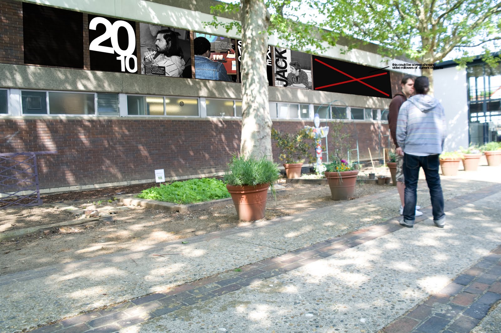
I got this idea from seeing the Kings college building, where they have old old images of people (im not sure if they are image of people who used to study there)..but i had it in my head to add so more typography and colour. So yh..


Wednesday, 26 May 2010


Subscribe to:
Comments (Atom)